2018年9月27日星期四

Through ETF invest China's stock market

Search ETF track the "FTSE China A50" index.


And the investor can invest China's stock market from the ETF.


More about "FTSE China A50" index, please browse " FTSE Russell" website.

1.1.5 Some concepts

The following article will explain some common concepts, such as:


  • Stock market index;
  • Secondary markets;
  • Funds
  • Exchange-traded fund
  • Repurchase agreement
  • Future

More articles, please see "English version index".

1.1.5 其他概念

接下来的文章会对一些常见概念的加以阐述,例如

指数
二级市场
基金
场内交易基金
国债逆回购
期货

更多文章,请浏览“中文版目录

2018年9月24日星期一

1.1.4.2 Two methods of fundamental analysis

The methods that traders often use when conducting fundamental analysis are:

  • From macro to micro analysis
  • From micro to macro analysis

Starting from a macro perspective, it will generally start with an analysis of the global economic situation, including global economic policies, monetary policy, population development, GDP, production efficiency, etc., as shown in the following figure.


With the deepening of the analysis, the focus of the analysis is gradually placed in a certain region or an industry, and finally gradually pushed to the specific enterprises that focus on research. Throughout the analysis, the analysis focused on the region or the specific enterprise's global competition. These analyses include comparisons of sales, prices, R&D, and more.

The analysis method from the microscopic point of view is to adopt the opposite analysis method as above.

Relative to the way of technical analysis, the fundamental analysis of the trader's requirements is:

  • Use longer time
  • Require a more comprehensive knowledge system

It is difficult for independent traders to complete fundamental analysis, and thus the use of fundamental analysis to conduct transactions requires more people to collaborate on the analysis. With the widespread use of computers and the Internet, many basic analytical tasks have begun to be processed using mathematical models, greatly reducing the labor costs of analysis.

[Thinking] When a trader refers to an analysis report, how to judge the reliability of the basic data and the rationality of the conclusion?

More articles, please see "English version index"

2018年9月23日星期日

1.1.4.2 基本面分析的两种方法

交易者在进行基本面分析时,经常采用的方法是:

  • 从宏观到微观的分析方法
  • 从微观到宏观的分析方法

从宏观的角度为出发点,一般会先从全球的经济形势开始分析,其中包括了全球的经济政策、货币政策、人口发展、GDP、生产效率等等情况,如下图所示


随着分析的深入,逐渐将分析的重点放到某个区域或者某个行业,最后逐步推到重点研究的具体企业。在整个分析过程中,其分析重点在于该区域或具体的企业在整个全球竞争所处的情况。这些分析中包含了销售、价格、研发、等等情况的对比。

而从微观角度为出发点的分析方式,则是采用了同上述相反的分析方式。

相对于技术分析的方式,基本面分析对交易者的要求是:


  • 使用更长的时间
  • 要求知识系统更为全面
独立的交易者很难完成基本面分析,由此对使用基本面分析进行交易这一行为,要求有更多的人协同完成分析。随着计算机和互联网的普遍使用,很多基本分析的任务已经开始使用数学模型进行处理,从而大大降低分析的人工成本。

【思考】交易者在参考分析报告时,如何判断分析报告基础数据的可靠性?

更多文章,请浏览“中文版目录

2018年9月19日星期三

1.1.4.1 Re-discussion of P/E ratio

In Section 1.1.1.7, there has been a basic interpretation of the P/E ratio. Since the P/E ratio is the most commonly used indicator in fundamental analysis, it is necessary to further explore it here.

P/E ratio = market price per share / earnings per share

The P/E ratio is governed by two factors:


  • Market price per share, this factor is changing every trading day;
  • Earnings per share: relatively stable, with each release of financial reports.

Therefore, when using the P/E ratio, traders must first understand that the current P/E ratio does not represent the current share price and earnings per share. The P/E ratio seen by traders is actually the corresponding value at a certain point in history.

Second, what puzzles traders most is that analysts have different interpretations of the P/E ratio.

Here we can only illustrate the different analysis results through extreme examples.


As can be seen from this table, the same P/E ratio can analyze different results and lead to different investment behaviors.

[Thinking] Many conclusions are based on logical reasoning, but for the use of conclusions, people tend to ignore the premise of their conclusions. Think about the premise of these two analyses? Is there a problem with this premise?

More articles, please visit the "English version index"


1.1.4.1 市盈率的再谈讨

1.1.1.7章节中,曾经对市盈率做过基本的解读,由于市盈率是基本面分析中最常用的一个指标,这里有必要再做进一步的探讨。

市盈率=每股市场价格/每股盈利

市盈率由两个因素制约:

每股市场价格,该因素每个交易日都在变化中;
每股盈利:相对稳定,随着每次财务报告的发布而变化。

因此,交易者在使用市盈率时,首先要了解到:当前看到的市盈率不代表当前股价和每股盈利的比值,交易者看到的市盈率其实是历史上某个时间点的对应值。

其次,最让交易者困惑的是,分析师对于市盈率高低的解读各有不同。

这里只能通过极端的例子,来说明不同的分析结果。


从这张表格可以看出,同一个市盈率可以分析出不同的结果,会导致不同的投资行为。

【思考】很多结论都是建立在逻辑推理基础上,但是对于结论的使用,人们往往忽略了其结论的前提。想想看这两种分析的前提是什么?该前提是否有问题?

更多文章,请浏览“中文版目录

2018年9月17日星期一

1.1.4 Fundamental analysis

In addition to the use of chart analysis tools, traders have a class of analysis tools - fundamental information.

As shown below:


The way traders use the “fundamental data” to analyze the symbols and analyze them using charts has a completely different philosophy.

When a trader analyzes fundamental data, the focus is on the basic state of the entity.

For example, if the transaction is stock, then when the information is used, the trader will think more about the company's operating status, financial status and the status of the entire industry.

In the analysis of the fundamental data, the trader's attention to the price of the current trading variety will be relatively reduced.

Traders from the macro economy to the current trading varieties will conduct a comprehensive analysis, hoping to find reasons to support the price increase or decline.

[Thinking] When conducting fundamental analysis, how to judge which of the obtained data is objective data and which are subjective analysis?

More articles, please see "English version index"

2018年9月16日星期日

1.1.4 基本资料

交易者除了使用图表类的分析工具外,还有一类分析工具——基本资料。

如下图所示


交易者使用“基本资料”对交易品种进行分析的方式,同使用图表进行分析,有着截然不同的理念。

交易者对基本资料分析时,关注的内容更多的集中在交易品种其对应的实体状况,比如交易的是股票,那么交易者在使用基本资料时,会更多的考虑该公司的经营状况、财务状况以及整个行业的状况。

在对基本资料分析时,交易者对于当前交易品种的价格,其关注程度相对会降低。

这种分析方式,也被称为“基本面分析”。

交易者从宏观经济到当前交易的品种,会进行全面的分析,并希望从中找到支持品种价格上升或下降的理由。

【思考】在进行基本面分析时,如何判断获得的资料中,哪些是客观数据,哪些是主观分析?

更多文章,请浏览“中文版目录

2018年9月13日星期四

1.1.3.5 Charting indicators

One of the most common parts of the Candle chart is the technical indicator area. As shown below:


In the above chart, the trader combines the three technical indicators with the candlestick and volume for analysis.

But before using analytical indicators, just like facing a new concept, first of all, what is the analytical indicator ?

The analytical indicators used on the chart are all one of the methods of "technical analysis" in the field of securities analysis.

[Technical Analysis] It is mainly based on the trading behavior that has occurred in history, and through the analysis of its price and transaction situation, trying to predict the next trend of the price, in order to guide investment.

"Technical analysis" is often referred to as "chart analysis." There are numerous technical indicators in the field of technical analysis. Some of the indicators have been tested for a long time and are still being used, and some of them are short-lived.

Common technical indicators are:

Relative Strength Index (RSI); Stochastic oscillator(KD); Moving Average Convergence/Divergence (MACD); Bias ratio (BIAS); On-balance volume (OBV)...

[Thinking] Among the many technical indicators, is the trader more reference indicators, the more beneficial to the transaction?

More articles, please see "English version index"

1.1.3.5 技术指标

在K线图中,一个最常用的部分就是技术指标区域。如下图所示:

在上图中,交易者将三种技术指标同蜡烛图和成交量组合在一起,进行分析。

不过在使用分析指标之前,就像面对一个新的概念一样,首先要知道分析指标是什么?

图表上使用的分析指标都是属于证券分析领域中“技术分析”的某一种方法。

【技术分析】主要依据历史上已经发生的交易行为,并通过对其价格和成交情况的分析,试图去预测价格下一步的趋势,以此来指导投资。

“技术分析”常常也被称之为“图表分析”。技术分析领域有众多的技术指标,有的指标经过了长时间的考验,目前一直还在被使用,而有些指标只是昙花一现。

常用的技术指标有:

相对强弱指数(RSI);随机指标(KD);指数平滑异同移动平均线(MACD);乖离率(BIAS);平衡成交量/能量潮(OBV)... ...

【思考】在众多的技术指标中,交易者是不是参考越多的指标,越有益于交易?


2018年9月10日星期一

1.1.3.4 Stability- Moving Average is better than price fluctuations

When a trader first contacts the trade, his attention is easily attracted by price fluctuations and is listed as the first observation target. Constantly fluctuating prices drive the trader's nervous system, make quick judgments following price changes, and often even signal the need for action.

This is a positive action of traders, hoping to grasp the behavior of the market changing at any time. Most people who are new to trading like this feeling, but little attention is paid to the slow-moving object, the moving average.

However, from the aspect of stability, it is because of the slow change of the moving average, which makes the stability of the moving average strong. For the facts of transactions that have occurred, the information depicted by the moving averages is more informative than the candlestick.

【example】


The picture above is a Candle stick chart. On the next trading day, if a candle is formed as shown below:


So which direction will the next moving average be developed?

This is a situation where the surface looks very easy to answer and the actual situation may vary greatly.
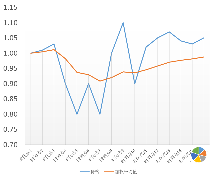
{Scenario 1}


If the new trading day price is time-varying as shown in the figure, then on the Candle stick chart, the average price upward graph is available.

{Scenario 2}


If the price fluctuations on the new trading day are as shown in the figure, then on the Candle stick chart, the graph of the average price upward may not be available.

[Thinking] Why is it easy for traders to put too much time and thinking on the observation of price fluctuations?

More articles, please see "English version index"

2018年9月9日星期日

1.1.3.4 均线——稳定性优于价格波动

交易者最初接触交易时,其注意力很容易被价格的波动吸引,而将其列为第一观察对象。价格不断地起起伏伏的变化,带动着交易者的神经系统,跟随价格变化进行快速的判断,甚至经常发出需要行动的信号。

这是交易者积极行动,希望把握市场随时变化的行为。大部分刚刚接触交易的人喜欢这种感觉,而对于变化缓慢的对象——均线,很少关注。

不过从稳定性这一方面来讲,正是由于均线的变化缓慢,使得均线的稳定性很强。对于已经发生的交易事实,相对于蜡烛图,均线描绘出的信息更具参考意义。

【例】


上图是一张K线图,接下来的交易日,如果形成了如下图所示的一个蜡烛


那么接下来绘制出的均线会向哪个方向发展呢?

这是一个表面看起来很容易回答,实际状况却可能有很大差异的情况。

{情景1}

如果新的交易日价格分时波动如图中所示,那么在K线图上,均价向上的图形是可以得到的。

{情景2}

如果新的交易日价格分时波动如图中所示,那么在K线图上,均价向上的图形可能无法得到。

【思考】交易者为什么容易把过多的时间和思考,放在价格波动这一观察对象上?

2018年9月7日星期五

1.1.3.3 Moving average line

Moving average line: The line that connects the average price.

This sentence seems very simple, its meaning hides a lot of relevant content, need to be explored.

Let's first look at a table that simulates price fluctuations.

【example】


According to price fluctuations, we can plot the price fluctuation curve as shown below:

If the recorded data is statistically calculated (by weighted average method), the average price is as follows:


Redrawing the chart and putting the price volatility and the average price together form a form that investors often browse.

The same principle, the average price in the Candle stick chart is also calculated using the same principle, and together with the candle stick, for traders to use.


More articles, please see the "English version index".

1.1.3.3 均线

均线是将平均价格连起来的一条线,这句话看起来很简单,其含义隐藏了很多相关内容,需要探讨。

我们先来看一张模拟价格波动而记录的表格。

【例】


根据价格波动,可以绘制出价格的波动曲线,如下所示


如果将记录的数据,加以统计计算(通过加权平均的方式)平均价格,如下表


此时重新绘制图表,将价格波动和均价放在一起,就形成了投资者经常观察到的形式了。


同样的原理,在K线图中的均价也是采用同样的原理计算,并和蜡烛图一起绘制在一起,供交易者使用。


更多文章,请浏览“中文版目录

2018年9月6日星期四

1.1.3.2 Time type of candlestick chart

When a trader first uses the candle stick  analysis, the first thing he sees is a combination of candlesticks drawn by the "trade day".

In practical applications, different traders may use different units of measure.

【example】

For a fixed time period of K line, there can be different display modes:

15 minutes candle stick


30 minutes candle stick


60 minutes candle stick


Daily candle stick

Weekly candle stick

[Thinking] What are the different effects on subsequent actions taken because of the different angles of observation for changes in the same time period?

More articles, please see English version index

1.1.3.2 蜡烛图的时间类型

交易者第一次使用K线分析时,首先看到的都是以“交易日”为计量单位进行统计而绘制的蜡烛图组合。

而在实际应用中,不同的交易者可能使用的是不同的计量单位。

【例】

对于一个固定的时间段的K线,可以有不同的显示方式:


15分钟K线


30分钟K线


60分钟K线


日线


周线


【思考】对于同一个时间段发生的变化,由于观察的角度不同,对后续采取的行动会有什么样不同的影响?

更多文章请参见中文版本目录

2018年9月5日星期三

1.1.3.1 Several candle stick

In the process of learning, traders should start with the simplest interface and gradually master each analysis tool.

【Example】


This is the simplest analysis graph, listing only the candlesticks for each trading day. These candles can be further identified.

The following are the four most common graphical situations:

1, the Bullish candle stick


This shows:

Closing price > opening price

The latter graph simulates a situation in which the price continues to fluctuate and finally forms a Bullish candle stick ( Please note that there can be many trends in the price curve, and finally the same Bullish candle stick can be formed).

2, the Bearish candle stick


This shows:

Closing price <opening price

The latter graph simulates a situation in which the price continues to fluctuate and finally forms a Bearish candle stick ( Please note that there can be many trends in the price curve, and finally the same Bearish candle stick can be formed).

3, the Cross star


This shows:

Closing price = opening price

The latter graph simulates a situation in which prices continue to fluctuate and eventually form a Cross star ( Please note that there can be many trends in the price curve, and finally the same Cross star can be formed).

4, a line


This shows:

Closing price = opening price, and there is no fluctuation in the price throughout the day

The following line diagram simulates the situation in which a line is formed.

More articles, please see "English version index"

1.1.3.1 几种蜡烛图

交易者在学习过程中,应该从最简单的界面入手,逐步把每一个分析工具掌握。

【例如】


这是一张最简单的分析图形,只罗列了每个交易日的蜡烛图。对这些蜡烛,可以进一步深入识别。

以下是最常见的四种图形情况

1、阳线


这表明了:

收盘价>开盘价

的情况。后面的曲线图,模拟了一种价格连续波动最后形成阳线的情形(请注意:可以有很多中价格曲线的走势,最后都可以形成同样的阳线)。

2、阴线


这表明了:

收盘价<开盘价

的情况。后面的曲线图,模拟了一种价格连续波动最后形成阴线的情形。

3、十字星


这表明了:

收盘价=开盘价

的情况。后面的曲线图,模拟了一种价格连续波动最后形成十字星的情形。

4、一条线

这表明了:

收盘价=开盘价,并且全天价格没有任何波动

的情况。后面的直线图,模拟了形成一条线的情形。

4.0 Observing Object Conversion - Observing Self (1)

As of now, the articles focus on the things outside the trader's own: concepts, propositions, strategies, and so on. These contents are ...